API
finance-plots exposes plotting and table helpers at the package root:
from finance_plots import (
    plot_returns,
    plot_rolling_returns,
    plot_rolling_volatility,
    plot_rolling_sharpe,
    plot_rolling_beta,
    plot_rolling_correlation,
    plot_return_scatter,
    plot_drawdown_underwater,
    plot_returns_heatmap,
    plot_returns_bar,
    plot_returns_dist,
    plot_returns_timeseries,
    plot_indicator_panel,
    plot_price_with_overlays,
    plot_trading_cost_breakdown_bar,
    plot_mfe_mae_scatter,
    plot_execution_quality,
    plot_ic_ts,
    plot_ic_hist,
    plot_ic_qq,
    plot_ic_by_group,
    plot_ic_heatmap,
    plot_rolling_ic,
    plot_quantile_returns_bar,
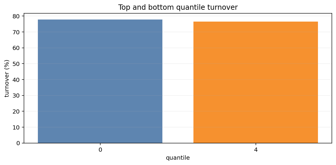
    plot_top_bottom_quantile_turnover,
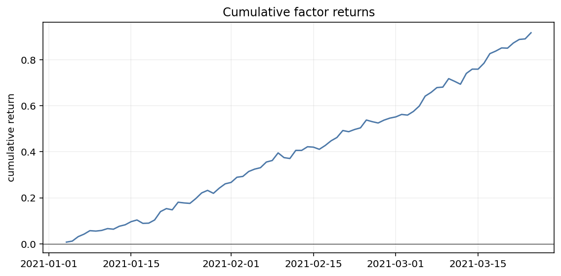
    plot_cumulative_factor_returns,
    performance_statistics,
    table_performance_statistics,
    table_period_returns,
    table_drawdowns,
    table_cost_breakdown,
    table_round_trip_stats,
    table_execution_quality,
    table_information,
    table_returns_by_quantile,
    table_turnover,
    table_quantile_statistics,
)
Plots accept Narwhals-compatible one-dimensional inputs such as pandas Series,
Polars Series, numpy arrays, and other supported backends. Plot functions return
matplotlib.figure.Figure. Table helpers either return a Python dictionary or a
great_tables.GT object.
Return and Risk Plots
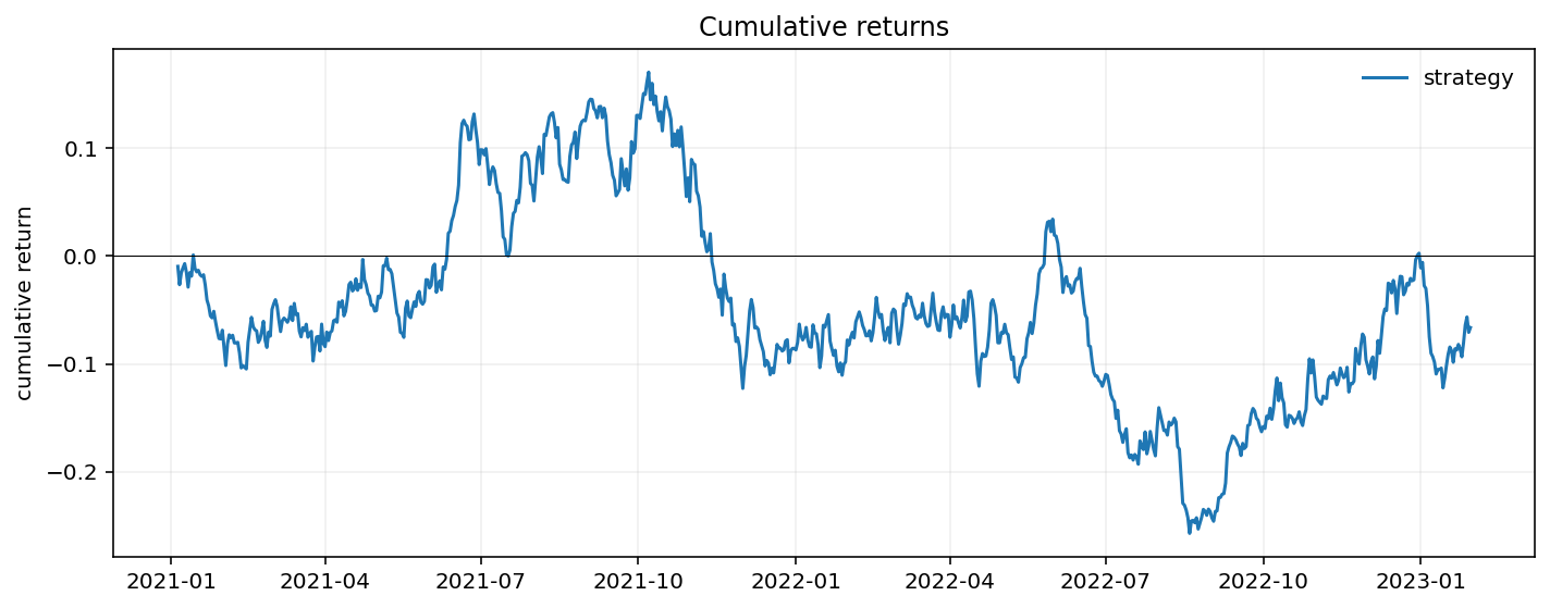
plot_returns(returns, live_start=None, log_scale=False, ax=None)
Cumulative strategy returns without requiring a benchmark argument.
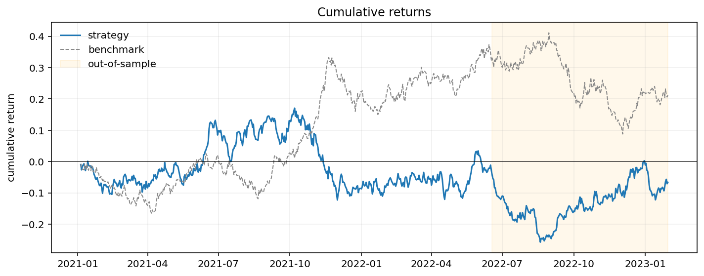
plot_rolling_returns(returns, benchmark=None, live_start=None, log_scale=False, ax=None)
Cumulative strategy returns with optional benchmark and out-of-sample shading.
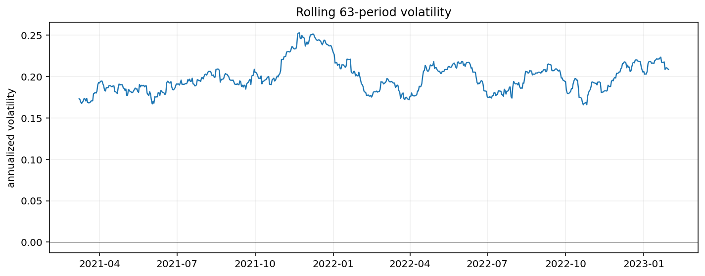
plot_rolling_volatility(returns, window=63, frequency="daily", ax=None)
Rolling annualized volatility.
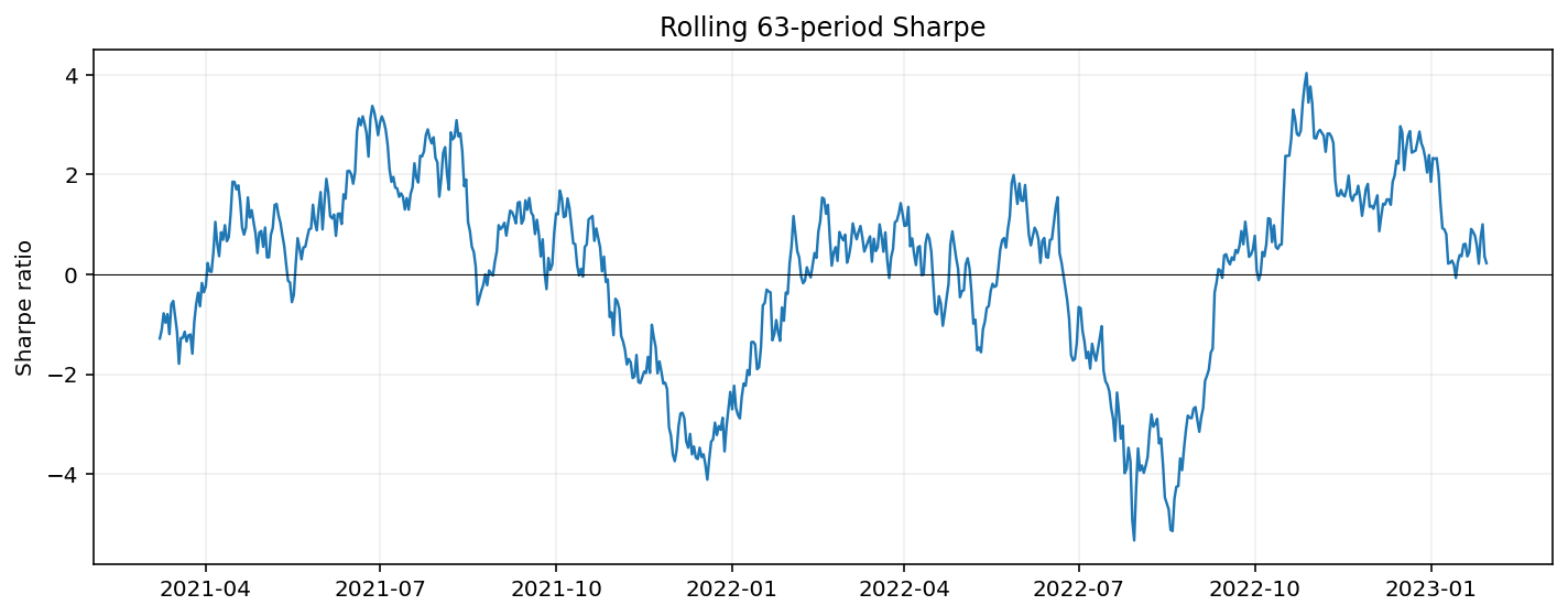
plot_rolling_sharpe(returns, window=63, frequency="daily", ax=None)
Rolling annualized Sharpe ratio.
plot_rolling_beta(returns, benchmark, window=63, ax=None)
Rolling beta versus a benchmark return series.
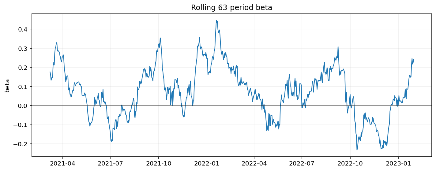
plot_rolling_correlation(returns, benchmark, window=63, ax=None)
Rolling correlation versus a benchmark return series.
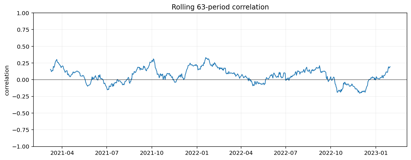
plot_return_scatter(returns, benchmark, ax=None)
Strategy returns plotted against benchmark returns with a fitted beta line.
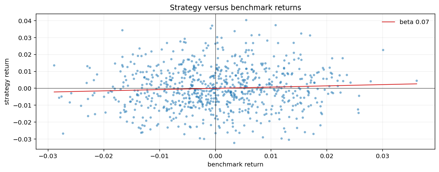
plot_drawdown_underwater(returns, ax=None)
Underwater drawdown chart built from compounded returns.
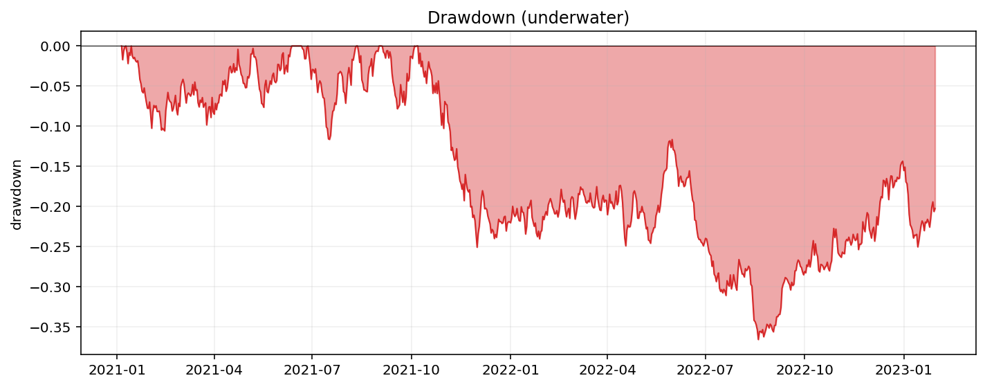
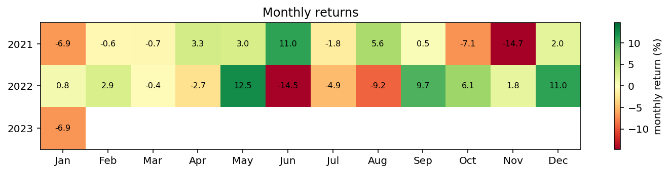
plot_returns_heatmap(returns, period="month", ax=None)
Calendar return heatmap for month, quarter, or week buckets.
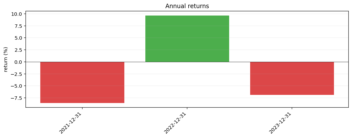
plot_returns_bar(returns, period="year", ax=None)
Compounded period returns as a bar chart.
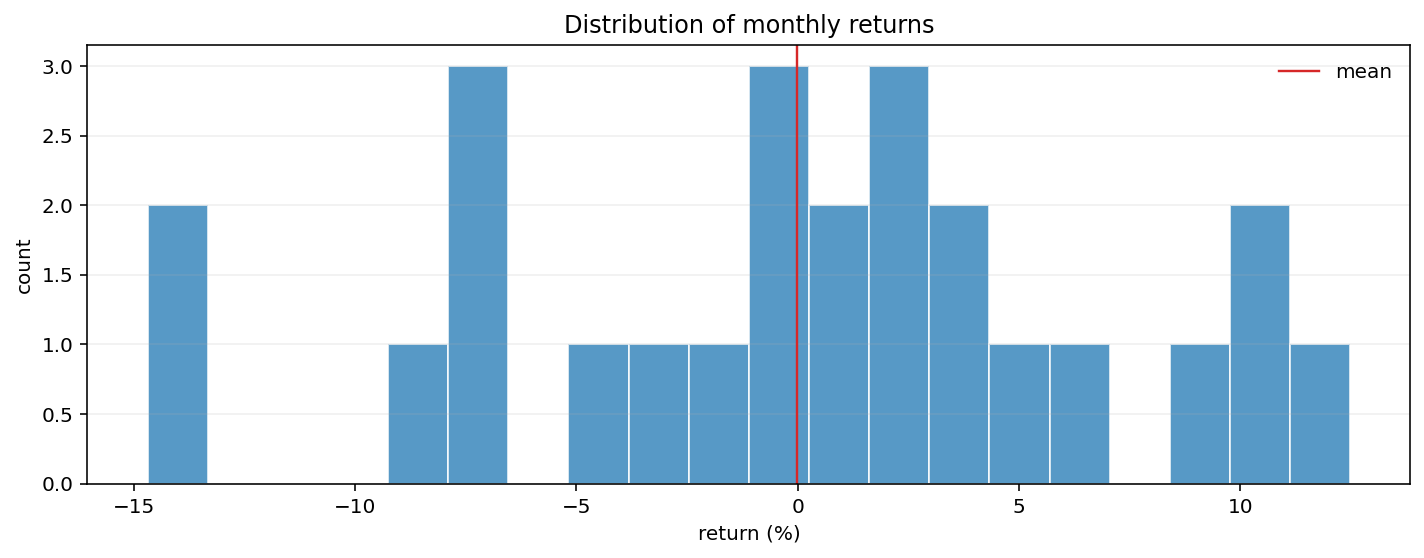
plot_returns_dist(returns, period="month", bins=20, ax=None)
Distribution of compounded period returns.
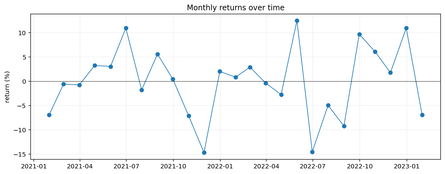
plot_returns_timeseries(returns, period="month", ax=None)
Compounded period returns through time.
Technical Indicator Plots
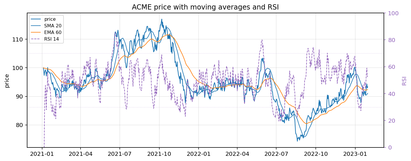
plot_price_with_overlays(price, overlays=None, secondary_overlays=None, secondary_ylabel=None, figsize=(10.0, 4.0), title=None)
Price line with same-axis overlays and optional right-axis indicators such as RSI.
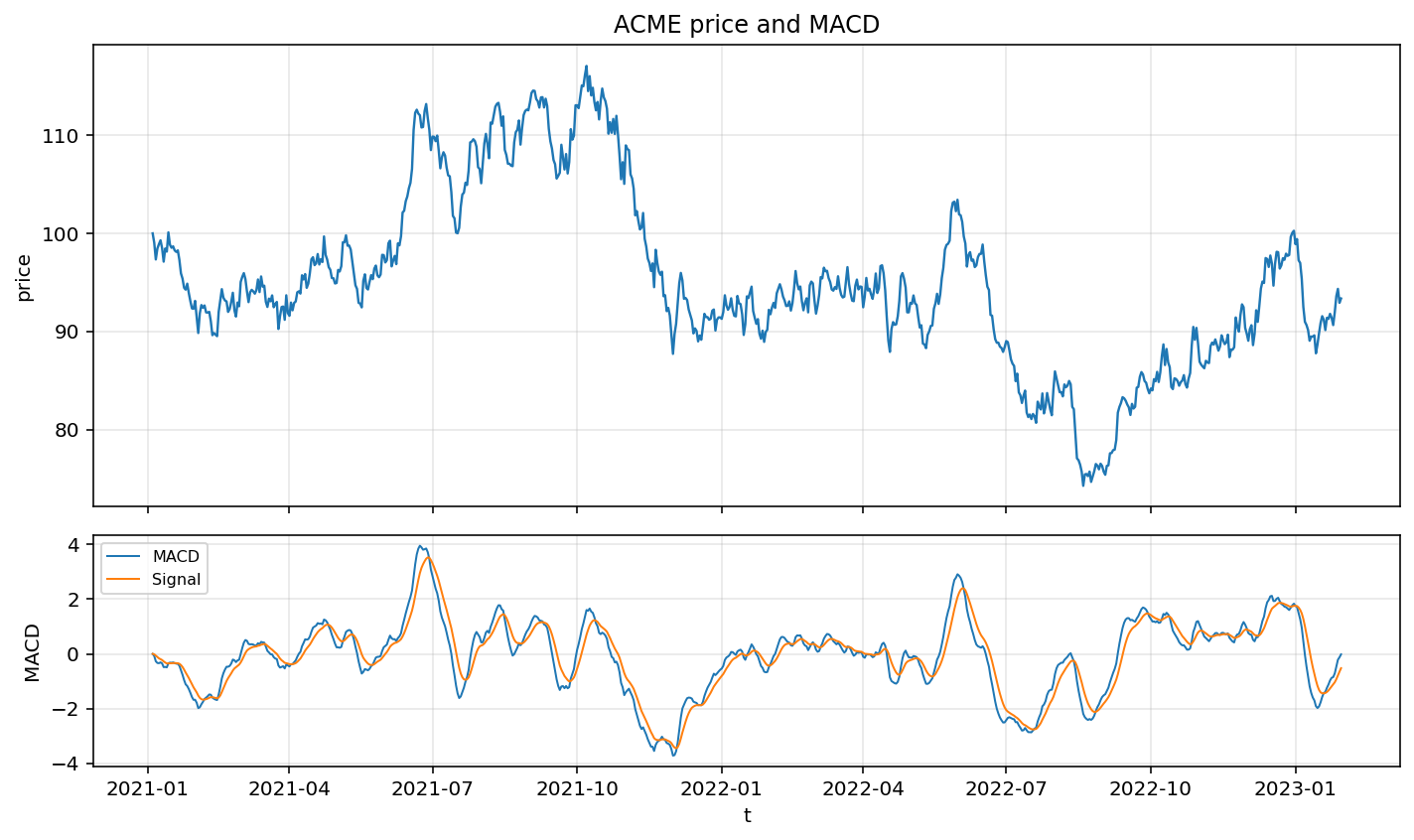
plot_indicator_panel(price, panels=None, figsize=None, title=None)
Price chart with configurable aligned indicator sub-panels.
Post-Trade Plots
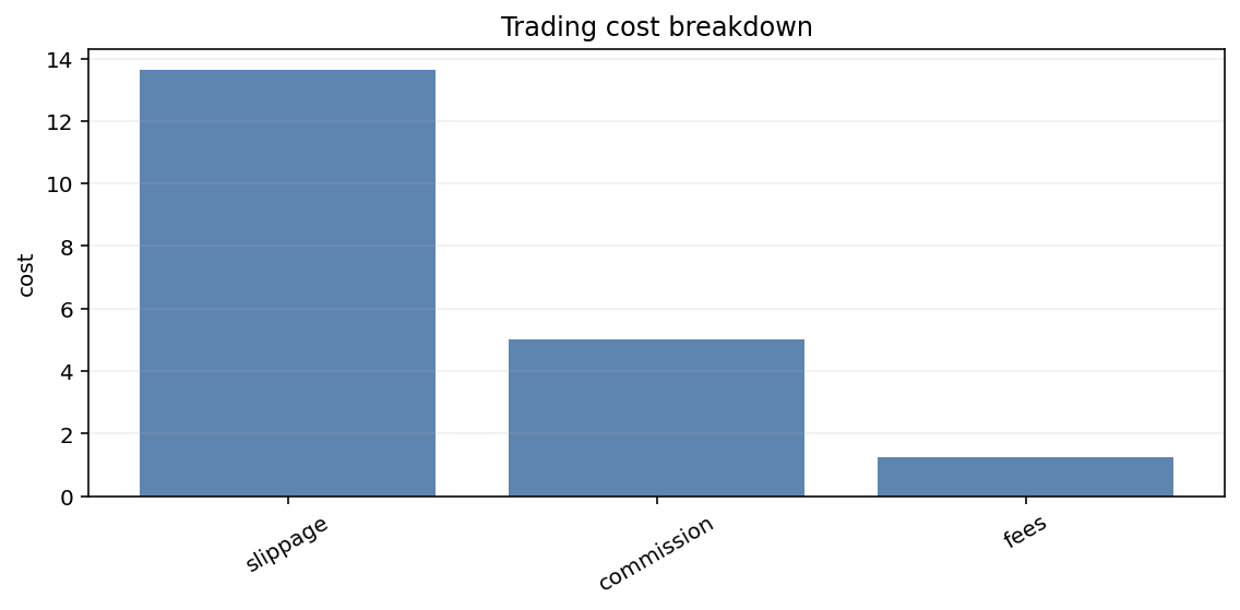
plot_trading_cost_breakdown_bar(costs, component_col="component", value_col="total", ax=None)
Trading cost attribution by component.
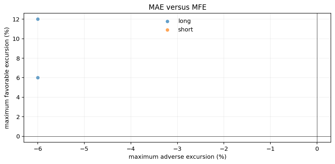
plot_mfe_mae_scatter(trades, mae_col="mae", mfe_col="mfe", side_col="side", ax=None)
Maximum adverse versus favorable excursion by trade.
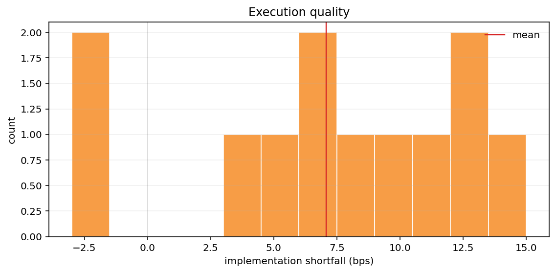
plot_execution_quality(executions, slippage_col="implementation_shortfall_bps", bins=20, ax=None)
Distribution of implementation-shortfall slippage in basis points.
Portfolio, Attribution, and Execution Plots
plot_efficient_frontier(expected_returns, covariance, points=50, ax=None)
Long-only mean-variance efficient frontier.
plot_market_impact_curve(impact_frame, participation_col="participation_rate", impact_col="impact_bps", ax=None)
Market impact against participation rate.
plot_execution_timeline(executions, time_col="timestamp", executed_col="executed_qty", target_col="target_qty", ax=None)
Cumulative execution versus target trajectory.
plot_cost_breakdown_bar(costs, component_col="component", value_col="total", ax=None)
Signed cost contribution by component.
plot_return_attribution_stacked(attribution, time_col=None, ax=None)
Stacked return attribution through time.
plot_portfolio_weight_evolution(weights, ax=None)
Portfolio weights through time.
plot_weight_diff(current, target, ax=None)
Target-minus-current weight differences.
plot_risk_decomposition_stacked(decomposition, ax=None)
Stacked risk contributions.
plot_factor_exposure_heatmap(exposures, ax=None)
Asset-by-factor exposure heatmap.
plot_correlation_matrix(covariance_or_correlation, labels=None, ax=None)
Correlation heatmap from a covariance or correlation matrix.
plot_covariance_eigenvalues(covariance, ax=None)
Ordered covariance eigenvalues.
Alpha-Analysis Plots
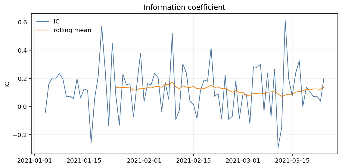
plot_ic_ts(ic, window=21, ax=None)
Information-coefficient time series with a rolling mean overlay.
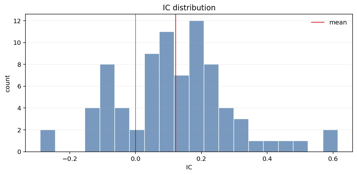
plot_ic_hist(ic, bins=20, ax=None)
Information-coefficient distribution.
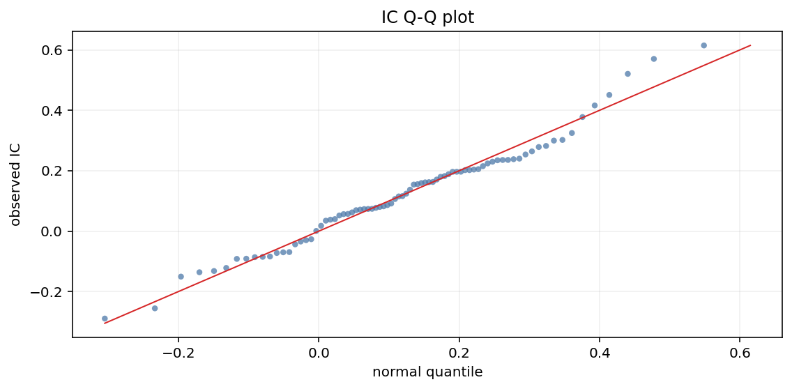
plot_ic_qq(ic, ax=None)
Information-coefficient Q-Q plot against a normal distribution.
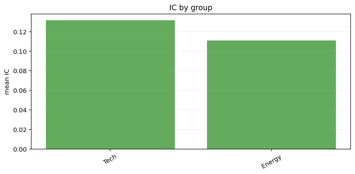
plot_ic_by_group(data, group_col="group", ic_col="ic", ax=None)
Mean information coefficient by group.
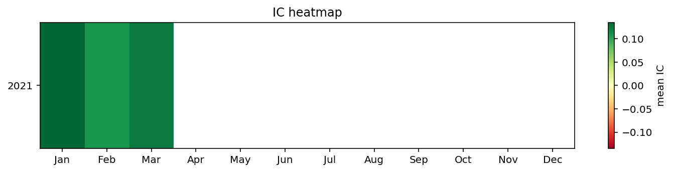
plot_ic_heatmap(ic, period="month", ax=None)
Calendar heatmap of mean information coefficient.
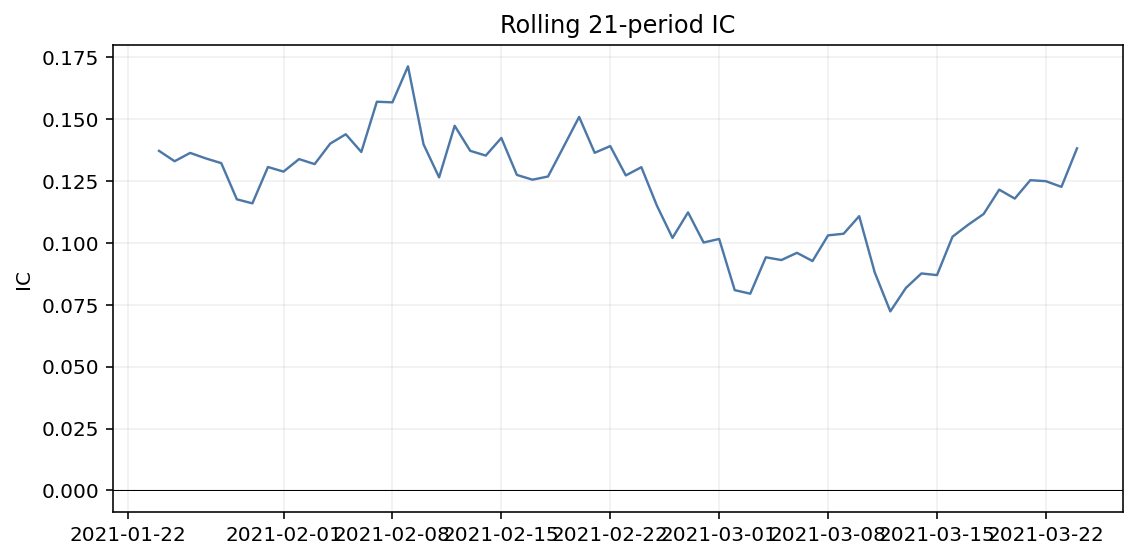
plot_rolling_ic(ic, window=21, ax=None)
Rolling mean information coefficient.
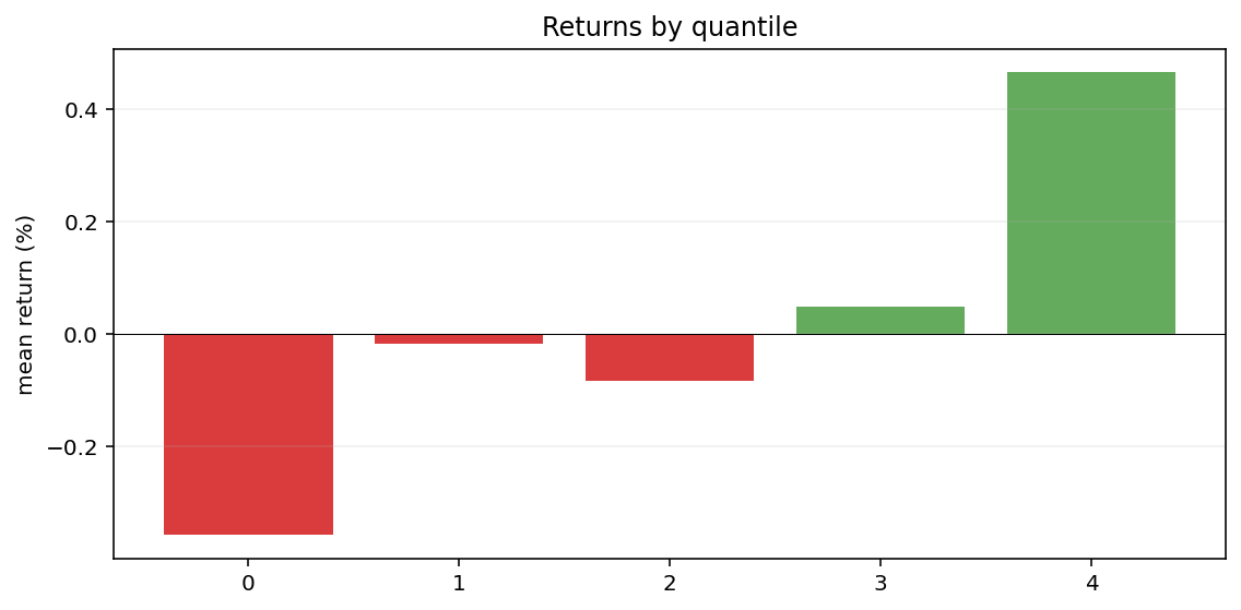
plot_quantile_returns_bar(data, quantile_col="quantile", return_col="return", ax=None)
Mean forward return by signal quantile.
plot_top_bottom_quantile_turnover(data, quantile_col="quantile", turnover_col="turnover", ax=None)
Turnover for the bottom and top signal quantiles.
plot_cumulative_factor_returns(factor_returns, ax=None)
Compounded long-short factor return path.
Performance Tables
performance_statistics(returns, frequency="daily")
Compute scalar performance statistics.
Metric |
Value |
|---|---|
Cumulative return |
-6.64% |
Annualized return |
-2.26% |
Annualized volatility |
19.82% |
Sharpe ratio |
-0.02 |
Sortino ratio |
-0.02 |
Max drawdown |
-36.56% |
Calmar ratio |
-0.06 |
table_performance_statistics(returns, benchmark=None, frequency="daily")
Build a Great Tables performance summary.
Metric |
Strategy |
Benchmark |
|---|---|---|
Cumulative return |
-6.64% |
21.19% |
Annualized return |
-2.26% |
6.62% |
Annualized volatility |
19.82% |
16.68% |
Sharpe ratio |
-0.02 |
0.47 |
Sortino ratio |
-0.02 |
0.68 |
Max drawdown |
-36.56% |
-22.92% |
Calmar ratio |
-0.06 |
0.29 |
table_period_returns(returns, period="year")
Build a Great Tables table of compounded period returns.
Period |
Return |
|---|---|
2021 |
-8.56% |
2022 |
9.66% |
2023 |
-6.89% |
table_drawdowns(returns, top=5)
Build a Great Tables table of the largest drawdown periods.
Rank |
Start |
Trough |
Recovery |
Drawdown |
Duration |
|---|---|---|---|---|---|
1 |
2021-10-07 |
2022-08-19 |
Unrecovered |
-36.56% |
480 |
2 |
2021-06-27 |
2021-07-17 |
2021-08-11 |
-11.64% |
45 |
3 |
2021-01-14 |
2021-02-14 |
2021-06-12 |
-10.57% |
149 |
4 |
2021-09-03 |
2021-09-18 |
2021-10-04 |
-7.83% |
31 |
5 |
2021-08-12 |
2021-08-21 |
2021-09-01 |
-5.70% |
20 |
Post-Trade Tables
table_cost_breakdown(costs, component_col="component", value_col="total")
Build a Great Tables trading-cost attribution summary.
Component |
Total |
Pct total |
|---|---|---|
commission |
5.00 |
25.15% |
fees |
1.25 |
6.29% |
slippage |
13.63 |
68.56% |
table_round_trip_stats(trades, pnl_col="pnl")
Build a Great Tables round-trip trade-quality summary.
Metric |
Value |
|---|---|
Trades |
3.00 |
Win rate |
66.67% |
Average PnL |
160.00 |
Total PnL |
480.00 |
Profit factor |
3.00 |
Payoff ratio |
1.50 |
table_execution_quality(executions, slippage_col="implementation_shortfall_bps")
Build a Great Tables implementation-shortfall summary.
Metric |
Value |
|---|---|
Count |
12 |
Mean bps |
7.08 |
Median bps |
7.50 |
Worst bps |
15.00 |
Best bps |
-3.00 |
Alpha-Analysis Tables
table_information(ic)
Build a Great Tables information-coefficient summary.
Metric |
Value |
|---|---|
Mean IC |
0.12 |
IC volatility |
0.17 |
ICIR |
0.71 |
t-stat |
6.38 |
Positive IC |
77.50% |
Observations |
80 |
table_returns_by_quantile(data, quantile_col="quantile", return_col="return")
Build a Great Tables mean-return-by-quantile table.
Quantile |
Count |
Mean return |
Volatility |
|---|---|---|---|
0 |
80 |
-0.36% |
0.75% |
1 |
80 |
-0.02% |
0.70% |
2 |
80 |
-0.08% |
0.74% |
3 |
80 |
0.05% |
0.70% |
4 |
80 |
0.47% |
0.65% |
table_turnover(data, quantile_col="quantile", turnover_col="turnover")
Build a Great Tables quantile-turnover summary.
Quantile |
Turnover |
|---|---|
0 |
77.81% |
1 |
78.12% |
2 |
78.28% |
3 |
78.59% |
4 |
76.56% |
table_quantile_statistics(data, quantile_col="quantile", signal_col="signal_mean", count_col="count")
Build a Great Tables quantile count and signal-statistics summary.
Quantile |
Count |
Signal mean |
Signal std |
|---|---|---|---|
0 |
640 |
-1.40 |
0.21 |
1 |
640 |
-0.53 |
0.19 |
2 |
640 |
0.01 |
0.18 |
3 |
640 |
0.53 |
0.16 |
4 |
640 |
1.38 |
0.24 |
Example Artifact Helper
Function |
Description |
|---|---|
|
Write maintained example plot and table artifacts |
Reference
- finance_plots.plot_returns(returns: Any, live_start: Any | None = None, *, log_scale: bool = False, ax: Axes | None = None) Figure[source]
Plot cumulative returns without requiring a benchmark argument.
- Parameters:
returns – 1-D series of periodic returns.
live_start – Optional index position or timestamp marking the in-/out-of-sample cutoff.
log_scale – If True, the y-axis is symlog.
ax – Existing matplotlib
Axesto draw onto.
- Returns:
The
matplotlib.figure.Figurecontaining the plot.
- finance_plots.plot_rolling_returns(returns: Any, benchmark: Any | None = None, live_start: Any | None = None, *, log_scale: bool = False, ax: Axes | None = None) Figure[source]
Plot cumulative returns with an optional benchmark overlay.
- Parameters:
returns – 1-D series of periodic returns (narwhals-compatible).
benchmark – Optional benchmark return series; plotted on the same axes.
live_start – Optional position in the index marking the in-/out-of-sample cutoff. The out-of-sample region is shaded.
log_scale – If True, the y-axis is symlog.
ax – Existing matplotlib
Axesto draw onto.
- Returns:
The
matplotlib.figure.Figurecontaining the plot.
- finance_plots.plot_rolling_volatility(returns: Any, window: int = 63, *, frequency: Frequency | str | float = Frequency.Day, ax: Axes | None = None) Figure[source]
Plot rolling annualized volatility.
- Parameters:
returns – 1-D series of periodic returns.
window – Rolling window length in observations.
frequency – Observation frequency alias, enum, or observations per year.
ax – Existing matplotlib
Axesto draw onto.
- Returns:
The
matplotlib.figure.Figurecontaining the plot.
- finance_plots.plot_rolling_sharpe(returns: Any, window: int = 63, *, frequency: Frequency | str | float = Frequency.Day, ax: Axes | None = None) Figure[source]
Plot rolling annualized Sharpe ratio.
- Parameters:
returns – 1-D series of periodic returns.
window – Rolling window length in observations.
frequency – Observation frequency alias, enum, or observations per year.
ax – Existing matplotlib
Axesto draw onto.
- Returns:
The
matplotlib.figure.Figurecontaining the plot.
- finance_plots.plot_rolling_beta(returns: Any, benchmark: Any, window: int = 63, *, ax: Axes | None = None) Figure[source]
Plot rolling beta versus a benchmark return series.
- Parameters:
returns – 1-D strategy return series.
benchmark – 1-D benchmark return series.
window – Rolling window length in observations.
ax – Existing matplotlib
Axesto draw onto.
- Returns:
The
matplotlib.figure.Figurecontaining the plot.
- finance_plots.plot_rolling_correlation(returns: Any, benchmark: Any, window: int = 63, *, ax: Axes | None = None) Figure[source]
Plot rolling correlation versus a benchmark return series.
- Parameters:
returns – 1-D strategy return series.
benchmark – 1-D benchmark return series.
window – Rolling window length in observations.
ax – Existing matplotlib
Axesto draw onto.
- Returns:
The
matplotlib.figure.Figurecontaining the plot.
- finance_plots.plot_return_scatter(returns: Any, benchmark: Any, *, ax: Axes | None = None) Figure[source]
Plot strategy returns against benchmark returns.
- Parameters:
returns – 1-D strategy return series.
benchmark – 1-D benchmark return series.
ax – Existing matplotlib
Axesto draw onto.
- Returns:
The
matplotlib.figure.Figurecontaining the scatter plot.
- finance_plots.plot_drawdown_underwater(returns: Any, *, ax: Axes | None = None) Figure[source]
Underwater drawdown plot.
- Parameters:
returns – 1-D series of periodic returns.
ax – Existing matplotlib
Axesto draw onto.
- Returns:
The
matplotlib.figure.Figurecontaining the filled-area drawdown plot.
- finance_plots.plot_returns_heatmap(returns: Any, *, period: Any = 'month', ax: Axes | None = None) Figure[source]
Year-by-
periodheatmap of compounded returns.- Parameters:
returns – 1-D series of periodic returns. Best results when the input has a
DatetimeIndex; otherwise the function assumes daily (‘B’) frequency starting at 2000-01-01.period – Calendar bucket per cell —
"month"(default),"quarter", or"week"— or afinance_enums.Frequencyvalue.ax – Existing matplotlib
Axesto draw onto.
- Returns:
The
matplotlib.figure.Figurecontaining the heatmap.
- finance_plots.plot_returns_bar(returns: Any, *, period: Any = 'year', ax: Axes | None = None) Figure[source]
Plot compounded returns by period as a bar chart.
- Parameters:
returns – 1-D series of periodic returns.
period – Calendar bucket:
"day","week","month","quarter", or"year".ax – Existing matplotlib
Axesto draw onto.
- Returns:
The
matplotlib.figure.Figurecontaining the plot.
- finance_plots.plot_returns_dist(returns: Any, *, period: Any = 'month', bins: int = 20, ax: Axes | None = None) Figure[source]
Plot a histogram of compounded period returns.
- Parameters:
returns – 1-D series of periodic returns.
period – Calendar bucket:
"day","week","month","quarter", or"year".bins – Histogram bin count.
ax – Existing matplotlib
Axesto draw onto.
- Returns:
The
matplotlib.figure.Figurecontaining the plot.
- finance_plots.plot_returns_timeseries(returns: Any, *, period: Any = 'month', ax: Axes | None = None) Figure[source]
Plot compounded period returns through time.
- Parameters:
returns – 1-D series of periodic returns.
period – Calendar bucket:
"day","week","month","quarter", or"year".ax – Existing matplotlib
Axesto draw onto.
- Returns:
The
matplotlib.figure.Figurecontaining the plot.
- finance_plots.plot_price_with_overlays(price: Any, overlays: Iterable[tuple[str, Any]] | None = None, *, secondary_overlays: Iterable[tuple[str, Any]] | None = None, secondary_ylabel: str | None = None, figsize: tuple[float, float] = (10.0, 4.0), title: str | None = None)[source]
Plot a price line with same-axis and optional secondary-axis overlays.
Use
overlaysfor moving averages, Bollinger / Donchian bands, or other indicator series measured in price units. Usesecondary_overlaysfor bounded or differently-scaled indicators such as RSI.- Parameters:
price – Narwhals-compatible 1-D price series.
overlays – Iterable of
(label, values)pairs, each the same length asprice.secondary_overlays – Iterable of
(label, values)pairs drawn on a right-hand y-axis.secondary_ylabel – Label for the right-hand y-axis.
figsize – Matplotlib figure size.
title – Optional figure title.
- Returns:
matplotlib.figure.Figure.- Raises:
ValueError – If an overlay’s length does not match
price.
- finance_plots.plot_indicator_panel(price: Any, panels: Sequence[dict] | None = None, *, figsize: tuple[float, float] | None = None, title: str | None = None)[source]
Plot a price chart on top of N indicator sub-panels.
- Parameters:
price – Narwhals-compatible 1-D price series.
panels – Iterable of panel specifications. Each panel is a dict with keys
title(str) andseries(iterable of(label, values)pairs). Eachvaluesmust be the same length asprice. IfNoneor empty, only the price panel is drawn.figsize – Matplotlib figure size. Defaults to
(10, 2 + 2*N)whereNis the number of indicator panels.title – Optional figure title.
- Returns:
matplotlib.figure.Figure.- Raises:
ValueError – If a panel series length does not match
price.
- finance_plots.plot_trading_cost_breakdown_bar(costs: Any, *, component_col: str = 'component', value_col: str = 'total', ax: Axes | None = None) Figure[source]
Plot total trading cost by component.
- finance_plots.plot_mfe_mae_scatter(trades: Any, *, mae_col: str = 'mae', mfe_col: str = 'mfe', side_col: str = 'side', ax: Axes | None = None) Figure[source]
Plot maximum adverse versus favorable excursion by trade.
- finance_plots.plot_execution_quality(executions: Any, *, slippage_col: str = 'implementation_shortfall_bps', bins: int = 20, ax: Axes | None = None) Figure[source]
Plot the distribution of execution-quality slippage in bps.
- finance_plots.plot_efficient_frontier(expected_returns: Any, covariance: Any, *, points: int = 50, ax: Axes | None = None) Figure[source]
Plot a long-only unconstrained mean-variance efficient frontier.
- finance_plots.plot_market_impact_curve(impact_frame: Any, *, participation_col: str = 'participation_rate', impact_col: str = 'impact_bps', ax: Axes | None = None) Figure[source]
Plot market impact against participation rate.
- finance_plots.plot_execution_timeline(executions: Any, *, time_col: str = 'timestamp', executed_col: str = 'executed_qty', target_col: str | None = 'target_qty', ax: Axes | None = None) Figure[source]
Plot cumulative executed quantity versus target trajectory.
- finance_plots.plot_cost_breakdown_bar(costs: Any, *, component_col: str = 'component', value_col: str = 'total', ax: Axes | None = None) Figure[source]
Plot signed cost contributions by component.
- finance_plots.plot_return_attribution_stacked(attribution: Any, *, time_col: str | None = None, ax: Axes | None = None) Figure[source]
Plot stacked return attribution through time.
- finance_plots.plot_portfolio_weight_evolution(weights: Any, *, ax: Axes | None = None) Figure[source]
- finance_plots.plot_weight_diff(current: Mapping[str, float], target: Mapping[str, float], *, ax: Axes | None = None) Figure[source]
- finance_plots.plot_risk_decomposition_stacked(decomposition: Any, *, ax: Axes | None = None) Figure[source]
- finance_plots.plot_factor_exposure_heatmap(exposures: Any, *, ax: Axes | None = None) Figure[source]
- finance_plots.plot_correlation_matrix(covariance_or_correlation: Any, *, labels: Sequence[str] | None = None, ax: Axes | None = None) Figure[source]
- finance_plots.plot_covariance_eigenvalues(covariance: Any, *, ax: Axes | None = None) Figure[source]
- finance_plots.plot_ic_ts(ic: Any, *, window: int = 21, ax: Axes | None = None) Figure[source]
Plot an information-coefficient time series.
- finance_plots.plot_ic_hist(ic: Any, *, bins: int = 20, ax: Axes | None = None) Figure[source]
Plot an information-coefficient histogram.
- finance_plots.plot_ic_qq(ic: Any, *, ax: Axes | None = None) Figure[source]
Plot information coefficients against normal quantiles.
- finance_plots.plot_ic_by_group(data: Any, *, group_col: str = 'group', ic_col: str = 'ic', ax: Axes | None = None) Figure[source]
Plot mean information coefficient by group.
- finance_plots.plot_ic_heatmap(ic: Any, *, period: str = 'month', ax: Axes | None = None) Figure[source]
Calendar heatmap of mean information coefficient.
- finance_plots.plot_rolling_ic(ic: Any, *, window: int = 21, ax: Axes | None = None) Figure[source]
Plot rolling mean information coefficient.
- finance_plots.plot_quantile_returns_bar(data: Any, *, quantile_col: str = 'quantile', return_col: str = 'return', ax: Axes | None = None) Figure[source]
Plot mean return by signal quantile.
- finance_plots.plot_top_bottom_quantile_turnover(data: Any, *, quantile_col: str = 'quantile', turnover_col: str = 'turnover', ax: Axes | None = None) Figure[source]
Plot turnover for bottom and top quantiles.
- finance_plots.plot_cumulative_factor_returns(factor_returns: Any, *, ax: Axes | None = None) Figure[source]
Plot compounded factor returns.
- finance_plots.performance_statistics(returns: Any, *, frequency: Frequency | str | float = Frequency.Day) dict[str, float][source]
Compute summary performance statistics.
- Parameters:
returns – 1-D series of periodic returns (narwhals-compatible).
frequency – Observation frequency alias, enum, or observations per year.
- Returns:
Dict keyed by
cumulative_return,annualized_return,annualized_volatility,sharpe,sortino,max_drawdown,calmar.
- finance_plots.table_performance_statistics(returns: Any, benchmark: Any | None = None, *, frequency: Frequency | str | float = Frequency.Day)[source]
Build a
great_tables.GTperformance-stats table.- Parameters:
returns – 1-D series of periodic returns.
benchmark – Optional benchmark return series. When provided, a second value column is added to the table.
frequency – Observation frequency alias, enum, or observations per year.
- Returns:
A
great_tables.GTtable with one column per series and one row per metric.
- finance_plots.table_period_returns(returns: Any, *, period: Any = 'year')[source]
Build a
great_tables.GTtable of compounded period returns.- Parameters:
returns – 1-D series of periodic returns.
period – Calendar bucket:
"day","week","month","quarter", or"year".
- Returns:
A
great_tables.GTtable with one row per period.
- finance_plots.table_drawdowns(returns: Any, *, top: int = 5)[source]
Build a
great_tables.GTtable of the largest drawdown periods.- Parameters:
returns – 1-D series of periodic returns.
top – Maximum number of drawdown periods to include.
- Returns:
A
great_tables.GTtable sorted by drawdown depth.
- finance_plots.table_cost_breakdown(costs: Any, *, component_col: str = 'component', value_col: str = 'total')[source]
Build a Great Tables cost-breakdown table.
- finance_plots.table_round_trip_stats(trades: Any, *, pnl_col: str = 'pnl')[source]
Build a Great Tables round-trip statistics table.
- finance_plots.table_execution_quality(executions: Any, *, slippage_col: str = 'implementation_shortfall_bps')[source]
Build a Great Tables execution-quality summary.
- finance_plots.table_information(ic: Any)[source]
Build a Great Tables information-coefficient summary.
- finance_plots.table_returns_by_quantile(data: Any, *, quantile_col: str = 'quantile', return_col: str = 'return')[source]
Build a Great Tables mean-return-by-quantile table.
- finance_plots.table_turnover(data: Any, *, quantile_col: str = 'quantile', turnover_col: str = 'turnover')[source]
Build a Great Tables quantile-turnover table.
- finance_plots.table_quantile_statistics(data: Any, *, quantile_col: str = 'quantile', signal_col: str = 'signal_mean', count_col: str = 'count')[source]
Build a Great Tables quantile signal-statistics table.
- finance_plots.gallery.generate_gallery(output_dir: str | Path = 'docs/assets/gallery', *, dpi: int = 144, close_figures: bool = True) dict[str, Path][source]
Generate image and table artifacts for the public example gallery.
- Parameters:
output_dir – Directory where artifacts should be written.
dpi – PNG resolution for matplotlib figures.
close_figures – Close figures after saving to avoid leaking GUI state.
- Returns:
Mapping from public plot/table name to the written artifact path.